It was the Halloween horror no one had been expecting: a series of mind-boggling graphs and charts presented at Saturday’s Downing Street press conference that purported to show the Covid-19 pandemic was out of control and a second national lockdown was needed.
But do the graphs and charts really support this? ROSS CLARK find outs …
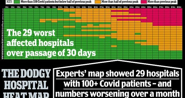
THE HEAT MAP
This chart was designed to show that some hospitals – shown in red – already had more Covid-19 patients than at the peak of the first wave in the spring.
Hospitals shown in amber have more than half as many virus patients as they had then, while green indicates hospitals with fewer than half the number of patients they had at the peak of the first wave.
Certainly the chart gave the impression that hospitals were already close to overflowing.
But the truth isn’t nearly as terrifying.
For while 29 hospitals are shown on the slide, the full dataset, published by NHS England, actually includes 482 NHS and private hospitals in England – at least 232 of which (and probably more as some entries were left blank) had not a single Covid-19 patient on October 27.
This is hardly surprising since official figures showed there were 9,213 patients in hospital with the disease on October 31, compared with 17,172 at the spring peak.
Even back then hospitals were far from full and the Nightingale units were virtually empty.
WHERE CASES ARE ACTUALLY FALLING
Chris Whitty unveiled two charts showing where in England Covid-19 infections were increasing, with brown and yellow zones highlighting where cases were up and blue showing they were down.
‘Virtually across the entire country now there is a significant rate of increase,’ announced the chief medical officer.
The map, however, begs to differ. In fact, it shows there are 34 districts in England where cases are static or falling.
Most remarkably – although it is difficult to spot, and only becomes obvious when you magnify the chart – it reveals that cases have fallen sharply across Merseyside over the past week, and that in parts of Liverpool they have fallen by more than 60 per cent.
This is significant because Liverpool was the first part of the country to be placed into Tier Three restrictions.
But if such measures appear to be working, why the need for the second national lockdown?
IS GROWTH REALLY EXPONENTIAL?
One slide – based on data from tests on a randomised sample of the population – showed ‘the prevalence of the disease has been going up extremely rapidly over the past few weeks’.
However, the chart actually suggested that the rate was no longer increasing exponentially, contrary to what Sir Patrick Vallance, the chief scientific adviser, predicted in his briefing of September 14.
While the chart shows that in mid-September cases of Covid were doubling almost every week, the most recent figures show that it has taken two and a half weeks for another two-fold rise.
REGIONAL RATES
Another slide consists of regional charts based on Office for National Statistics data about the prevalence of Covid-19 in the general population.
Professor Whitty heralded this as proof that ‘there is an increase in every part of the country apart possibly from the North East, where they have been taking additional measures – and there is some evidence of some flattening but not so far of falling’.

Yet the graph on the slide didn’t tally with that. It instead showed a clear fall in infection numbers in the North East.
Moreover, the curve is clearly flattening in London, the West Midlands and the South East.
VIRUS SLOWING AMONG MOST VULNERABLE
A further chart shows confirmed Covid-19 cases, week by week, for each region of England, split by age group with under-16s at the bottom and the over-60s at the top.
Professor Whitty used it to claim that the infection ‘steadily moves up the ages, so it doesn’t remain constrained by any one age group’.
The ripple change in the colours certainly seemed to support this.
But on closer inspection – only visible if you magnify the image – it becomes clear the chart contains figures in each coloured box for infections per 100,000 people.
What they show is that, crucially, rates of infection are growing much more slowly among the vulnerable over-60s than among young people in September, when there was a surge among students.
It has taken 24 days for over-60 cases to double in the North East and the North West, and 18 days in London.
In the North West new cases have been flat for four days – suggesting the pandemic is not ripping through the over-60s as previously assumed.
R RATE IN REVERSE
The R number is the average number infected by a single carrier. If the figure is below one, the epidemic withers; above one and it grows.
This slide clearly showed that the R number had fallen back in the past three weeks to between 1.1 and 1.3 – suggesting that while the epidemic was still growing, it was doing so at a slower rate.
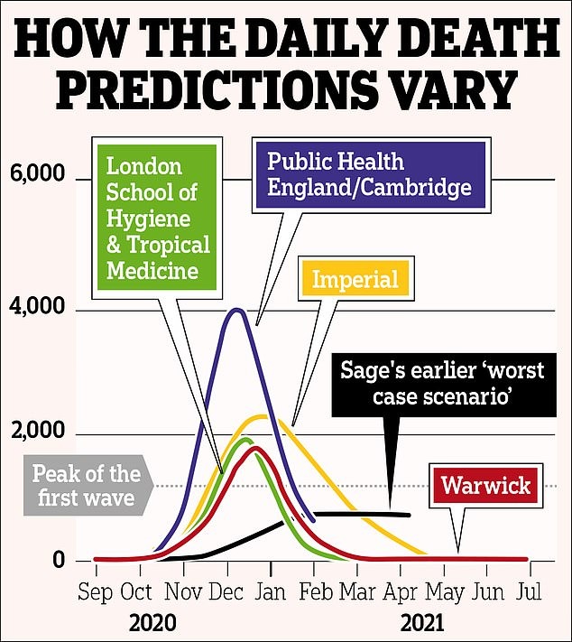
Yet despite this encouraging sign, Sir Patrick used the slide as an opportunity to explain that the Government has asked academics to produce scenarios of what might happen ‘on assumptions that R stays above one and goes between 1.3 to 1.5 and possibly up over the course of the winter’.
But why would they use such an inflated value, especially given the recent restrictions in Tier Three and Three areas? Naturally, he didn’t say.
Source: Daily Mail

